QtIntfMockups-DericksIdea
Revision as of 05:00, 2 January 2007 by Zephyrxero (talk | contribs) (added note about volume slider)
This is Derick Eisenhardt's concept for how VLC 0.9's new interface should look.
I think there are a few slight changes that would help VLC look better and be more usable. What I have done here is simply move around the buttons a bit, and made a quick and dirty mock-up for layout's sake. I can make a pretty version of it later if you guys like this button layout.
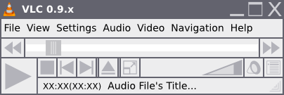
- Play/pause has been moved to the far left and enlarged because it is the most commonly used button
- Playlist button has been moved to the far right for easy access
- FastForward and Rewind Buttons have been moved to the sides of the progress bar
- The volume bar and mute button are also now right justified
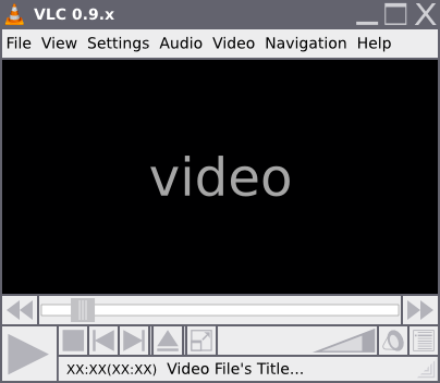
- All buttons (besides the standard File/Main Menu) have been moved to reside below the video portion
- A fullscreen button has been added right after the new position of the eject button
- do note there is a spacer on both sides of the eject button
- the fullscreen button can either be "grey'd out" or completely removed when there is no video
- The text box with the current play speed has been removed to save space and can easily be replaced with an icon overlayed on top of video just as you would see when pressing pause
- Also in the text box I think it would be great (if possible) to have the media file's title scroll when too long to fit into the box (ala WinAmp and XMMS).